
Freelance
Pronto!
A sauce brand that talks like family
Overview
In 2019, a new sauce and pasta brand from western Santa Catarina needed branding, identity and communication. The chef had gone to Italy to learn the secrets of sauces and light pasta, and the idea was to sell more than a product: an experience. The work started from four pillars: organic with no preservatives, gourmet, premium and traditionally Italian.
Two audiences, one memory
Millennials who pay more for healthy food and Gen X looking for everyday quality. Both meet in the family recipe handed down through generations.
A name with an exclamation
“Pronto!” says the sauce is ready, ends the meal like a celebration and plays with Italian, where “pronto” answers the phone and greets whoever arrives.
Sauce colors
Red, green and white with black for support, plus room for yellows and oranges that follow each sauce’s tone.
Love takes time
A short, clear and playful tone of voice, always open to conversation, to build a warm and close brand.
The process
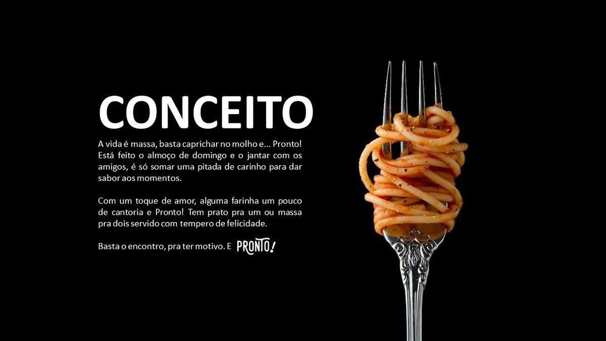
Concept
“Life is pasta, just nail the sauce.” The brand story is an ode to nostalgia and family.
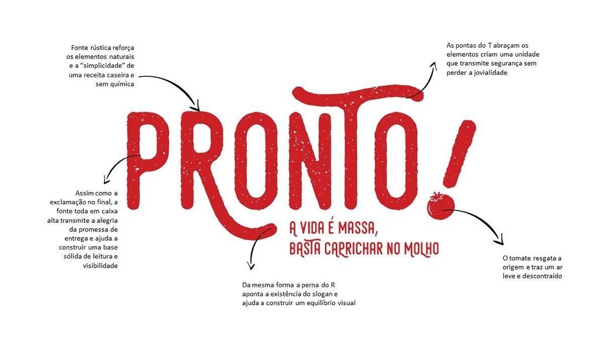
The logo
Rustic letters that evoke natural ingredients, an exclamation mark that becomes a signature and a tomato that points to the sauce’s origin.

Trend analysis
Quality and convenience, belonging and nostalgia (soul food) and love brands: the more a brand shares about itself, the closer people get.

Image style
Lively everyday photos that look like Brazilian homes, with diverse families. Stills on colored backgrounds for some topics.

What to avoid
No posed, stereotyped, background-less or color-altered photos. The brand has to look like real life.
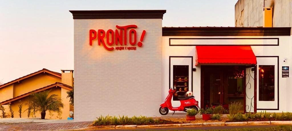
Application
The identity on the shop front, with the red awning and the delivery scooter.
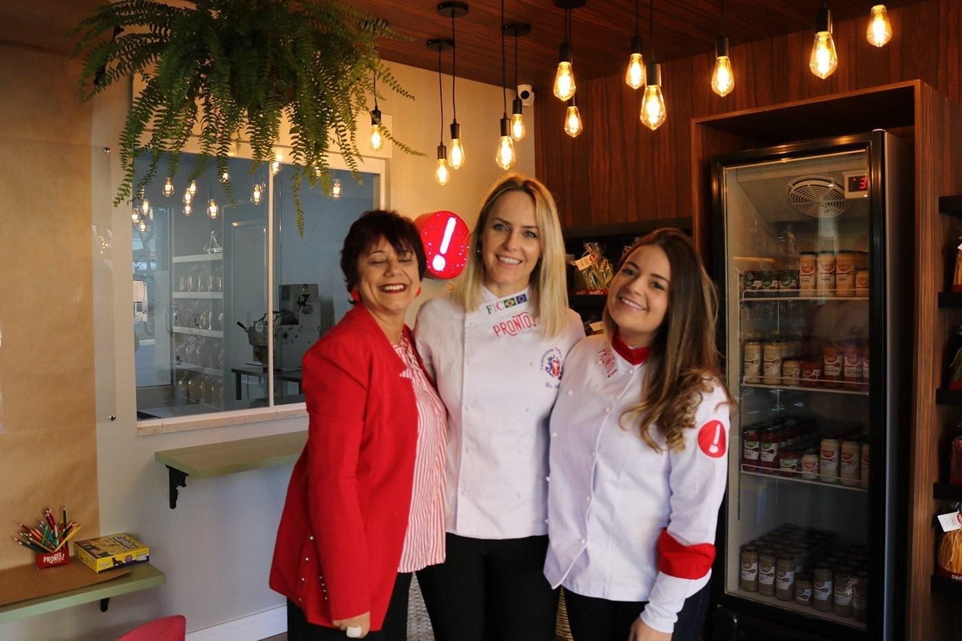
In store
The Pronto! team wearing uniforms with the brand’s exclamation mark.
Impact
A young brand that feels like a family recipe, with room to grow.
Credits
- Agency
- Ideiaria